OVERVIEW
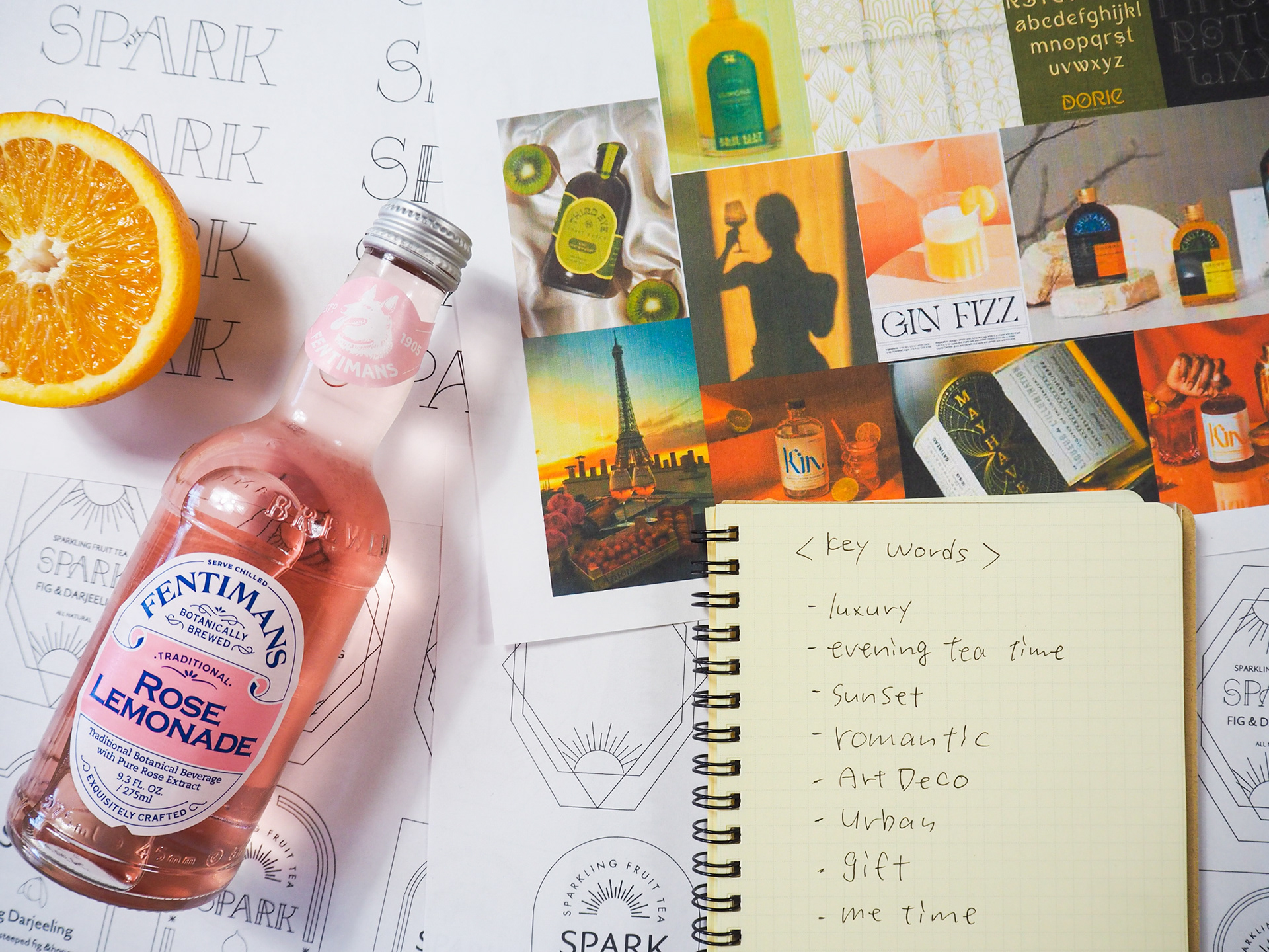
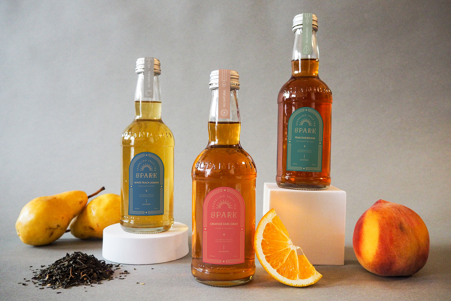
SPARKは天然素材を使用した、ノンカフェインのスパークリングフルーツティーです。夕焼けや星空を眺めながらちょっと贅沢な自分時間を楽しむ「イブニングティータイム」をコンセプトにしています。メインターゲットは30歳から35歳の、自分へのプチご褒美やプチギフトを探している女性です。妊娠中の友人へのプレゼントとして、体にやさしいプチギフトを探した経験から着想を得ました。「飲料のコンセプト立案とパッケージデザイン」が元の課題です。
SPARK is a non-caffeine sparkling fruit tea contains all natural ingredients. The concept is "Evening teatime." Enjoy luxury me time watching the sunset and starry sky with SPARK. Main target are 30 to 35 years old women who are looking for a small gift for friends or themselves. I got the idea when I was looking for a gift for my pregnant friend. The original assignment was "Create a concept and packaging for the beverage."
SOLUTION
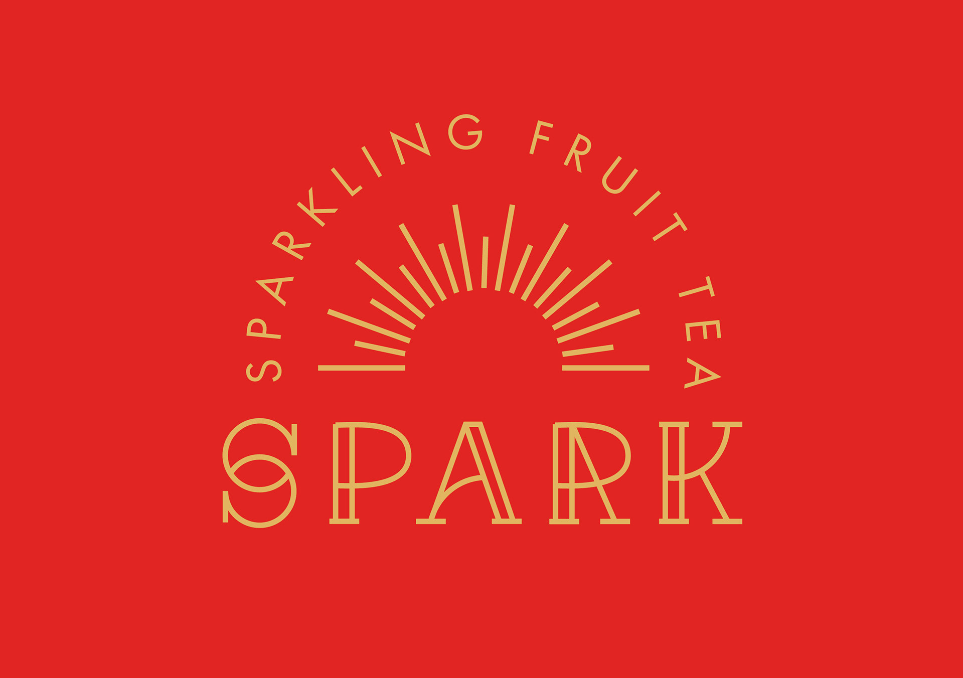
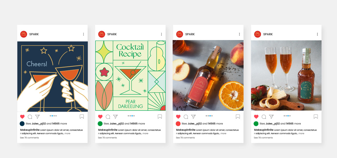
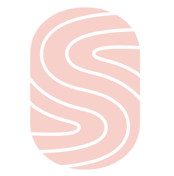
コンセプトに合わせて豪華で優雅な印象のあるアートデコスタイルを選びました。ロゴはアートデコと夕日をイメージしています。背が高くなだらかな曲線が特徴のオリジナルのフォントに、夕日のモチーフと、華奢な印象で背の高いFuturaを組み合わせました。「背の高い」ボトル、ラベル、フォントと、「細くて華奢なライン」のフレーム、イラスト、フォントを選んでいます。また、星やSPARK(きらめき)を思わせるモチーフをラベルやインスタグラムポストに使用しました。ラベルの色はそれぞれ3つのフレーバーをイメージしました。
I chose Art Deco which is gorgeous and elegant because it matches with the concept of the SPARK. The logo is inspired by Art Deco style and sunsets. I use Art Deco inspired custom type and Futura, and placed elements to create a sunset-arch shape. I chose elongated shape for the bottle, label, typeface, and a thin line illustration style. Also, I used "spark" and a star-like shape for the label and social media posts. Colors are coming from flavors.
PROJECT TYPE
Concept / Name / Packaging / Social media / Photo
YEAR
Fall 2020 / Logo and Packaging class / 4 Weeks
KEY WORDS
Art Deco / Elongated / Line works
TYPEFACE
Futura / Classico / Gallery Modern